CSS
CSS, or Cascading Style Sheets, is a styling language used to control the visual appearance of HTML elements on a web page. It allows developers to define the layout, fonts, colors, and other visual elements of a web page. With CSS, you can control the size and position of elements, add backgrounds and borders, create animations and transitions, and much more. It is essential for creating visually appealing and user-friendly, as well as responsive, websites.
Include CSS in HTML
-
Inline
<p style="font-size: 16px;">Hello World!</p> -
<style> tag
<p>Hello World!</p> <style> p { font-size: 16px; } </style> -
Link to external CSS file
<link rel="stylesheet" href="<relative file path>">The CSS file:
This component was made by Stratis Dermanoutsos. The code can be found here. -
Import external CSS file inside <style> tag
<style>
  @import url("<relative file path>");
</style>
The CSS file:
This component was made by Stratis Dermanoutsos. The code can be found here.
Note that, if you have 2 or more external stylesheets in your HTML, the one linked last is more !important than the one(s) above it.
Specificity
Specificity is a weight that is applied to a given CSS declaration, determined by the number of each selector type in the matching selector.
Selector Types
- Least specific
- Type selectors ( p )
- pseudo-elements ( ::before )
- Somewhat specific
- Class selectors ( .link )
- attributes selectors ( [type=“text”] )
- pseudo-classes ( :hover )
- Very specific
- ID selectors ( #name )
Exceptions
-
!important
When an !important rule is used on a style declaration, this declaration overrides any other declarations. Using !important, is bad practice and should be avoided because it makes debugging more difficult.
Some simple rules:
- Look for a way to use specificity before even considering !important
- Only use !important on page-specific CSS that overrides foreign CSS (from external libraries, like Bootstrap)
- Never use !important when you’re writing a plugin/mashup
- Don’t use !important on site-wide CSS
-
:is() and :not()
The matches-any pseudo-class :is() and the negation pseudo-class :not() are not considered a pseudo-class in the specificity calculation.
-
:where()
The pseudo-class :where() always has its specificity replaced with zero.
Prefixes
Prefixes are used to add CSS features, knowing that each browser will support them.
Most common prefixes are:
- -webkit- (for Android, Chrome, iOS, Safari)
- -moz- (for Firefox)
- -ms- (for Internet Explorer)
- -o- (for Opera)
For example, to ensure a transition would work on almost every browser, we’d have to write this
Positions
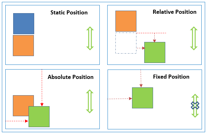
The position property specifies the type of positioning method used for an element.
Possible values are:
-
absolute
This component was made by Stratis Dermanoutsos. The code can be found here.An element with this position value is positioned relative to the nearest positioned ancestor. If there is no ancestor, it uses the document body.
Absolute positioned elements are removed from the normal flow and can overlap other elements.
-
fixed
This component was made by Stratis Dermanoutsos. The code can be found here.This value positions the element relative to the viewport. In other words, it always stays in the same place even if the page is scrolled.
-
relative
This component was made by Stratis Dermanoutsos. The code can be found here.An element with the relative position value is positioned relative to its normal position.
Setting the top, right, bottom and left properties of such element will adjust it away from its normal position.
-
static
This component was made by Stratis Dermanoutsos. The code can be found here.HTML elements are positioned static by default.
Static positioned elements are not affected by the top, right, bottom and left properties.
An element with this position value is not positioned in any special way and follows the normal flow of the page.
-
sticky
This component was made by Stratis Dermanoutsos. The code can be found here.A sticky element toggles between relative and fixed, depending on the scroll position. It is positioned relative until a given offset position is met in the viewport. Then, it ‘sticks’ in place (like an element with the fixed value)
Responsive design
There are some basic steps to follow in order to make a website resposive.
-
Paste
<meta name="viewport" content="width=device-width, initial-scale=1.0">inside the <head> element of the HTML document.
-
Don’t use large fixed width or height for elements.
For example, ‘500px’ can be overwhelming for some devices’ screens. Instead, use min-width or max-width (similar for height) attributes.
-
Use the HTML <picture> tag for images.
<picture> <source media="(min-width:650px)" srcset="img_lg.jpg"> <source media="(min-width:465px)" srcset="img_md.jpg"> <img src="img.jpg" alt="Image" style="width:auto;"> </picture> -
Use responsive units.
This component was made by Stratis Dermanoutsos. The code can be found here. -
Use Display layouts.
Using Grid or Flex layout is always beneficial in order to make a web page responsive.
-
Use media CSS queries.
Media query is a rule to include a block of CSS properties only if a certain condition is true.
This component was made by Stratis Dermanoutsos. The code can be found here.Logical operators ‘and’, ‘or’ and ‘not’ can be used for multiple conditions.
This component was made by Stratis Dermanoutsos. The code can be found here. -
Use ‘auto’ for media.
If the ‘width’ property is set to a percentage and the ‘height’ is set to ‘auto’, the image will be responsive.
Viewport Units
Viewport units are size measuring units oftenly used in responsive design. They’re truly “responsive length units” in the sense that their value changes every time the browser resizes.
These include:
-
Viewport Height (
vh)This unit is based on the height of the viewport. A value of 1vh is equal to 1% of the viewport’s height.
-
Viewport Width (
vw)This unit is based on the width of the viewport. A value of 1vw is equal to 1% of the viewport’s width.
-
Viewport Maximum (
vmax)This unit is based on the larger dimension of the viewport. If the viewport’s height is larger than the width, the value of 1vmax will be equal to 1% of viewport’s height. Similarly, if the viewport’s width is larger than the height, the value of 1vmax will be equal to 1% of hte viewport’s width.
-
Viewport Minimum (
vmin)This unit is based on the smaller dimension of the viewport. If the viewport’s height is smaller than the width, the value of 1vmin will be equal to 1% of the viewport’s height. Similarly, if the viewport’s width is smaller than the height, the value of 1vmin will be equal to 1% of the viewport’s width.
Code snippets
Custom cursor
Zoom image on hover
Center anything
-
Flexbox
This component was made by Stratis Dermanoutsos. The code can be found here. -
Position
This component was made by Stratis Dermanoutsos. The code can be found here. -
Grid
This component was made by Stratis Dermanoutsos. The code can be found here.
Smooth scrolling
Comment regions
Very useful in collapsing large groups of code.