Design
Dark mode
Enabling the switch between dark and light mode can greatly improve the user experience.
Steps to do dark mode right:
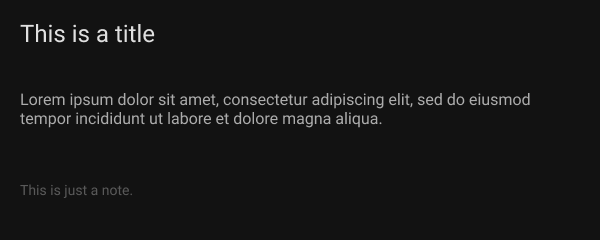
Never go with pure black
#000000 is a color that should never be used in UI designs in general, apart from some texts.
Prefer colors like:

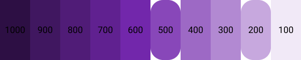
Limit the saturation
When you choose a color, limit the saturation to levels of 200-500.
Going less than 200 has no point in choosing a color.
Exceeding 500 will damage the contrast.
White for text
The text is always going to be fine with a #FFFFFF color code.
In case you want to have colors draw less attention, just decrease the opacity.
Avoid using shadows
This is pretty straightforward.
Dark mode is better suited for flat designs and the shadows will prevent this.
Instead, change the background color of components and make it lighter for higher ones.
Refer to Never go with pure black.